
Condensed layout + sticky footer on mobile
Hypothesis
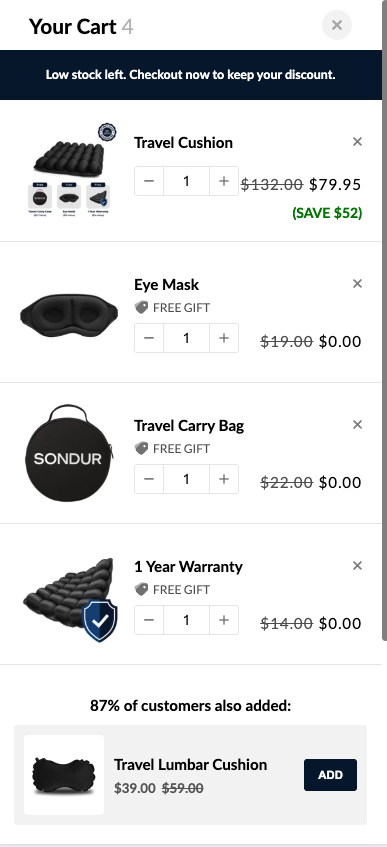
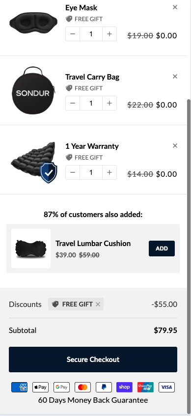
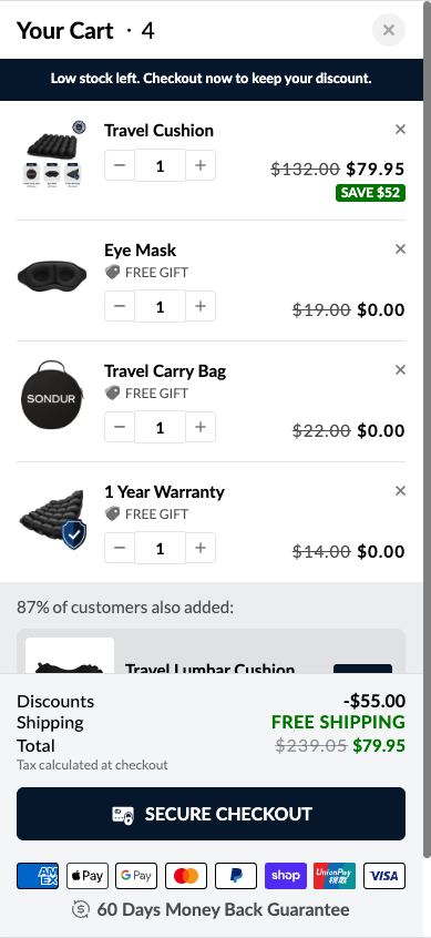
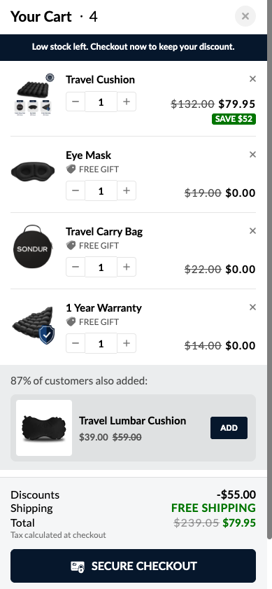
We believe that condensing the cart item layout and making the checkout footer sticky on mobile will increase conversion rate and upsell take rate because the condensed design allows visitors to see all free gifts and the upsell in a single viewport (stronger perceived value + better upsell visibility), and the sticky footer eliminates friction by keeping the checkout button always accessible, removing an unnecessary scroll action before purchase. SPECIFIC CHANGES BEING TESTED 1. Condensed Cart Item Layout • Control: Full-height cart items with large product images • Variation: Compressed items with smaller thumbnails, tighter spacing • Goal: Fit main product + all 3 free gifts + upsell in single mobile viewport 2. Sticky Checkout Footer • Control: Static footer, users must scroll to see checkout button • Variation: Sticky footer fixed to bottom showing subtotal + "SECURE CHECKOUT" button + payment badges • Why: Button always visible = zero friction to checkout 3. Enhanced Upsell Visibility • Control: "87% of customers also added" buried below scroll • Variation: Upsell visible in first viewport due to condensed layout • Why: Increased visibility should improve attachment rate 2 variations: • Variation 1 - we will make the footer with the checkout button and the total summary redesigned and sticky • Variation 2 - we will make the footer with the checkout button and the total summary redesigned and NOT sticky (like it’s not sticky in control)
What we learned
Variation 1 with the sticky footer is a winner. Prominently showing the free gifts and the order summary via sticky cart footer added more clarity for the customers and reduced cart friction (then didn’t have to scroll to Checkout button)
Want tests like this on your store?
Free teardown: we walk your store live and show you the three highest-impact tests we would run first.