
Redesign above the fold
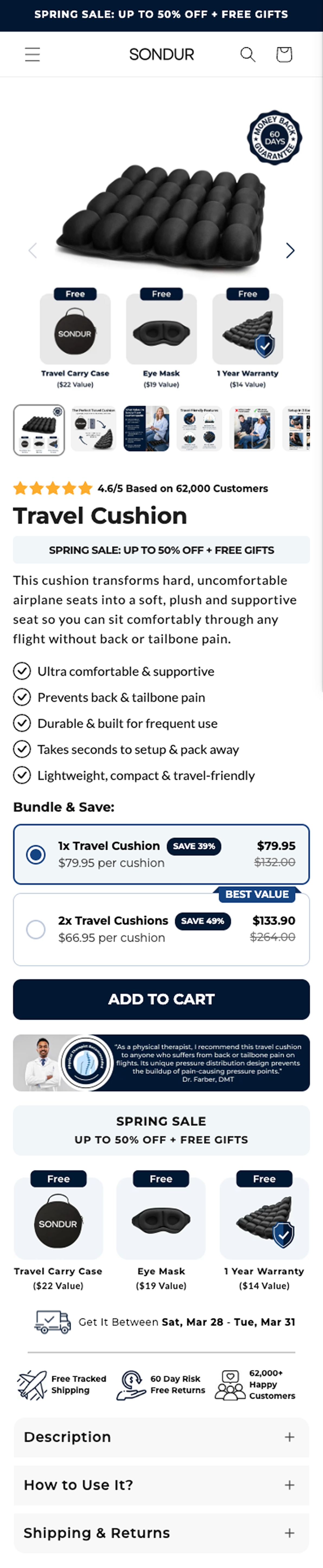
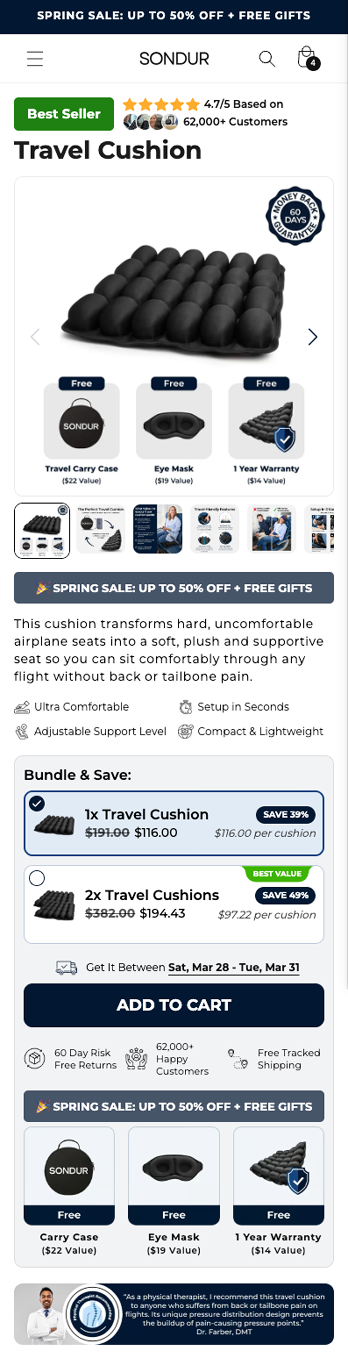
Hypothesis
HYPOTHESIS We believe that redesigning the PDP to lead with social proof, add a Best Seller badge, simplify benefit scanning with icons, and use card-style bundle selectors will increase conversion rate because the new layout makes trust signals more prominent and the purchase decision easier to process. When visitors see 62,000 customers and a 4.7/5 rating BEFORE the product name, they receive immediate social validation that reduces skepticism. The Best Seller badge leverages bandwagon psychology (if everyone's buying it, it must work). Icon-based benefits with a scannable grid layout allow faster information processing than text-heavy checkmarks. Card-style bundle selectors create clearer visual hierarchy, making the "Best Value" 2-pack option more prominent and easier to select. This trust-first information architecture prioritizes answering the critical question problem-aware visitors need answered: "Will this product actually solve MY pain?" SPECIFIC CHANGES BEING TESTED 1. Social Proof Above Product Name • Control: Product name → then rating • Variation: Rating (4.7/5, 62,000 customers) → then product name • Why: Answer "Does this work?" before telling them what it is 2. Best Seller Badge • Control: No badge • Variation: Green "Best Seller" badge top-left • Why: Psychological trigger (if others bought it, it must be good) 3. Benefits: Icons vs Checkmarks • Control: 5 benefits with checkmarks (pain-point focused copy) ◦ "Ultra comfortable & supportive" ◦ "Prevents back & tailbone pain" ◦ "Durable & built for frequent use" ◦ "Takes seconds to set up & pack away" ◦ "Lightweight, compact & travel-friendly" • Variation: 4 benefits with icons (feature-focused copy) • Why: Icons are faster to scan, grid layout is more visually organized • Trade-off: Losing pain-point specificity ("Prevents back & tailbone pain") for scannable brevity ("Back & Neck Support") 4. Bundle Selector: Radio Buttons → Card Style • Control: Traditional radio button selectors • Variation: Card-style boxes with visual hierarchy • Why: Cards create clear visual separation, "Best Value" badge stands out more, feels more premium 5. Delivery Date Positioning • Control: Below trust badges • Variation: Above trust badges (higher visibility) • Why: Creates urgency earlier, "Get it between Mar 15-18" shown before they click ATC 6. Trust Badge Reordering • Control: "Free Tracked Shipping | 60 Day Risk Free Returns | 62,000+ Happy Customers" • Variation: "60 Day Risk Free Returns | 62,000+ Happy Customers | Free Tracked Shipping" • Why: Lead with risk reversal (60-day guarantee) vs shipping, keep social proof (62k customers) in trust badges since it's also at top 7. Expandable Sections Pushed Lower • Control: Description/How to Use/Shipping & Returns positioned mid-page • Variation: Same sections pushed further down page • Why: Prioritize conversion elements (bundle, ATC, trust badges) over educational content; engaged buyers will scroll for details WHY THIS REDESIGN WILL WORK • Trust-first hierarchy: Social proof (62k customers) answers "Does this work?" before product name answers "What is this?" • Visual clarity: Icon grid + card-style bundles are easier to scan than text lists + radio buttons • Psychological validation: Best Seller badge + leading with reviews leverages bandwagon effect • Urgency earlier: Delivery dates shown before ATC button plants timeline in mind • Reduced friction: Clearer bundle selection and streamlined information hierarchy
What we learned
What happened (top-line) - Variation lost: Conversion rate 9.11% → 8.42% (≈ -7.6%) - Revenue per visitor $11.01 → $10.32 (≈ -6.3%) - AOV $120.86 → $122.56 (≈ +1.4%), not enough to offset lower conversion - Primary leak appears early: ATC rate down ≈ -6.1% (biggest directional mover). Downstream rates are mixed/smaller (begin checkout -6.2%, abandoned checkout +3.7%, abandoned cart +1.5%). Likely reasons the redesign underperformed (ranked by plausibility) 1) Offer comprehension / bundle selector friction (BOGO + gifts) - The variation introduced a new card-style bundle module + "Best Value" hierarchy + potentially different price placement. With BOGO + multiple gifts, users need to quickly understand "what do I get, what do I pay, and what do I select?". If the module adds even slight confusion, it shows up as lower ATC. - In your own notes: price placement changed (right side → under BOGO), "Bundle & Save" wording, and a new physical recommendation element (not in control). All of these can increase cognitive load at the exact decision point. 2) Trade-off: scannability vs persuasion (loss of pain-specific benefit copy) - Control had 5 longer, pain-point benefits; variation shortened to 4 icon benefits and used different copy. For a higher effective price point (BOGO) buyers may need more reassurance, not less. Icons can scan faster, but may reduce perceived specificity/credibility. 3) Trust signals moved up, but "why this works for me" became less clear - Leading with social proof + Best Seller can reduce skepticism, but if it pushes the product story/unique value lower or makes the header feel like "generic ecommerce", it can weaken the fit narrative ("this solves my back/tailbone pain on flights"). That would also primarily hit ATC rather than later checkout steps. 4) Quality/accuracy issues can materially hurt trust - You called out a mismatch: rating should be 4.6/5 (not 4.7/5). Even small inconsistencies create "something feels off" friction, especially when the entire redesign is anchored on social proof as the first thing users see. 5) Segment mismatch: winners in Google, losers elsewhere (creative/traffic intent interaction) - Channel cut suggests Google improved (CR +12%, RPV +12%) while Facebook/Instagram/Klaviyo declined. That pattern often happens when higher-intent traffic tolerates changes (or benefits from clearer trust cues), while lower-intent / colder traffic needs stronger pain-story + less friction to select the offer. - This indicates the redesign might be situationally good, but not a universal PDP default without segmenting by traffic source or intent level. Notes on "% orders by quantity" chart - Since the 3 free gifts count as units, unit-quantity distributions are not a reliable read of bundle selection behavior here. Focus on offer selection events (bundle click / variant selection), ATC, and checkout step funnels instead of units-per-order from analytics. What to check next (diagnostics to confirm the hypotheses) - Funnel by step: PDP view → bundle selection interaction → ATC click (not just ATC rate). Look for lower interaction or higher "hesitation" in the offer module. - Clickmaps/recordings: do users scroll past the bundle module, mis-click, open FAQs, or hesitate at price/BOGO language? - Device split: card-style selectors sometimes degrade more on mobile (spacing, fold, thumb reach). - New vs returning: returning visitors may be more sensitive to layout/offer changes; new visitors may need pain-based persuasion. Recommended next iteration (fast follow test) A) Keep the layout improvements but remove the main risk variables: - Use the same benefit copy length as control (pain-point bullets), even if you keep icons. - Revert bundle module to control structure/price placement (price on right) while keeping the social proof/top trust stack. - Remove "Bundle & Save" wording and the physical recommendation element for a cleaner decision path. - Fix the rating/review values to be accurate (4.6/5). B) If you want to test "social proof first", isolate it: change only the header ordering + Best Seller badge, keep offer module identical to control. Core learning - This redesign likely failed not because "trust-first is wrong", but because the variation bundled multiple high-impact changes at the decision point (offer module + copy + new elements). The net effect increased friction and reduced ATC, and the small AOV lift could not compensate.
Want an agency that shows you its losses?
Every agency has losing tests. We're the ones who publish them. Free teardown: we walk your store live and show you the three highest-impact tests we would run first.