
UI iteration: upsells + products
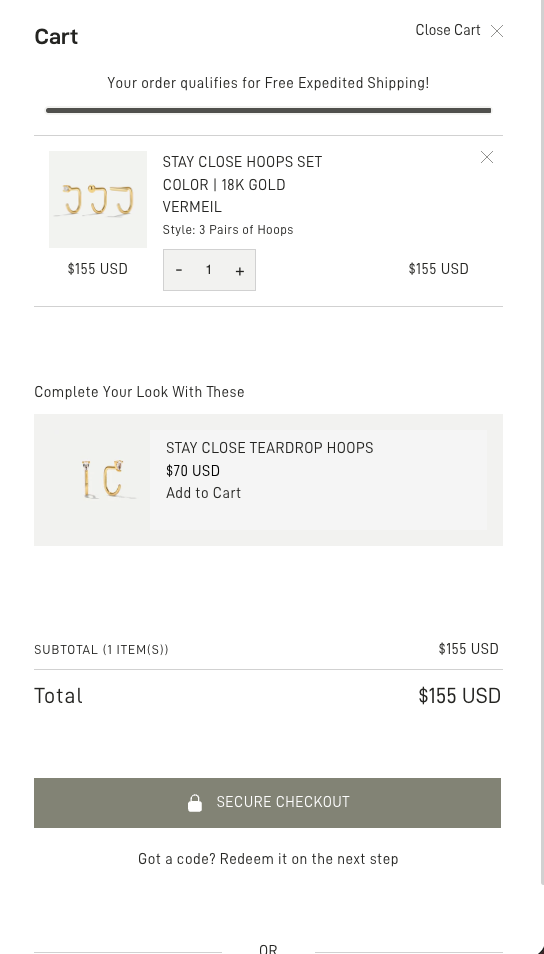
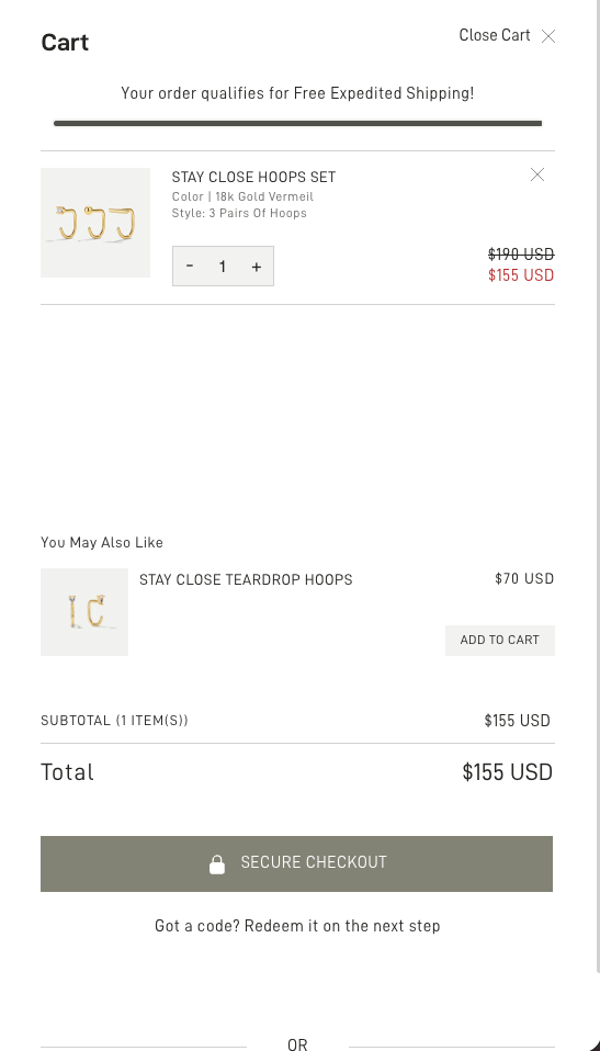
Hypothesis
If we redesign the cart item and upsell cards to feel less visually overwhelming and more premium/brand-aligned, then we expect to see improvements in CR & AOV, because a cleaner, more polished UI reduces cognitive load, increases trust, and creates a perception of quality that encourages users to complete their purchase (and accept upsells).
What we learned
Conversion & Revenue: • CVR: +8.04% (1.985% → 2.145%) • RPV: +7.98% ($2.11 → $2.28) • PPV: +7.96% ($1.64 → $1.77) • AOV: No change ($106.35 → $106.29) • Est. +1,524 orders/month · Est. +$160,820 revenue/month Statistical Note: Confidence level: 99.4% (one-tailed z-test). Clean, statistically significant winner above the 95% threshold. Key Learnings: ✅ Reduced cognitive load at checkout converts: The cart is the highest-intent moment in the funnel. Removing visual clutter reduced drop-off where it matters most ✅ Compare-at price in cart reinforces value: Showing $190 crossed out next to $155 activates anchoring at the exact moment the buyer is deciding whether to complete the purchase ✅ Premium presentation reduces purchase anxiety: A cart that matches the brand aesthetic builds trust and reduces last-second hesitation ⚠️ AOV unchanged: This test was a UI cleanup, not an upsell optimisation. A follow-up test targeting upsell acceptance rate is the right next step Recommendation: WINNER, Ship it 99.4% confidence. Highest estimated monthly revenue impact of any test in this series. Roll out immediately.
Want tests like this on your store?
Free teardown: we walk your store live and show you the three highest-impact tests we would run first.